Up to 40% off Selected Flooring + TRIPLE FLYBUYS - Book today and purchase before 31st May 2024

Introducing 'Pantone Colours of the Year' into your home

09 Feb 2021

The Pantone colour institute is essentially the global ‘trendsetter’ for colour. They are the unit within Pantone which highlight the top seasonal colour of the year, forecasting global colour trends and partnering with brands to effectively leverage the power, psychology, and emotion of colour in their design strategy.

To mix things up a bit for 2021, Pantone has chosen two colours – Yellow and Gray. Why two instead of one? Well, it's all to do with the rocky road that was 2020. Pantone wanted a marriage of “two independent colours that highlight how different elements come together to support one another. Practical and rock-solid but at the same time warming and optimistic”.

How the colours are chosen

For over 20 years, Pantone’s Colour of the Year has influenced not only the fashion industry, but home furnishings, industrial design, product packaging and graphic design.

The selection requires thoughtful consideration and trend analysis with Pantone’s colour experts combing the world looking for new colour influences. Films in production, art collections, emerging artists, travel destinations as well as current socio-economic conditions.

Influences may also stem from social media platforms and even sporting events that capture global attention.

Mood board inspiration

We’ll inspire you to incorporate 2021's Pantone colours, playing with textures and shades, letting the grey ground you and letting the yellow shine!

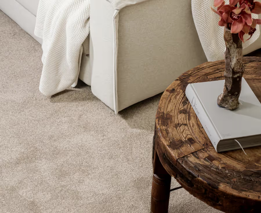
This image features Harrisons Ellis Island 740 Carpet & Laminate flooring Amour Classic Midnight Oak. TIP: If you prefer timber flooring, I recommend the Pergo Gotland range.

Creating a canvas to build from

This brushed wallpaper is the perfect backdrop for some iconic yellow statements and the apex is that you can completely restyle your home the next year with minimal cost.

Tip: Use a grey floor as a base for bright and colourful décor, combining it with red, mustard or orange accents to create a lively, fun space. Or go for an edgy vibe with metallic colours like gold or silver. Take a look at Harrisons Pergo Wide and Long Plank (colour 3568) to achieve this look.

Introducing grey

Grey can be used as a foundation for countless interior styles, allowing for both subtle and bold looks. Because grey is neutral, it works well with almost every other colour, making it one of the easiest colours to combine.

For that reason alone, grey is here to stay! Adding accents of yellow will assist you in creating a happy, spontaneous and feel-good space.

Tip: With such a neutral base, adding accents of yellow through yellow textured pillows or a throw. Consider adding art with splashes of yellow for a statement piece on the wall

Introducing yellow

Yellow is illuminating, which is aspirational and gives us hope. We need to feel that everything is going to get brighter – this is essential to the human spirit.

Tip: Have fun with the Pantone 2021 Colours of the Year! Explore different combinations and layers to add interest to your surroundings.

My selection

You have not added a product to your selection yet.

Browse our range

94%of reviewers recommend us
Average
Reviews
You can trust Harrisons Carpet
Hundreds of verified customer reviews